Overview
My individual contribution.
As a member of a team of four, I had the opportunity to design and evaluate an interactive interface aimed at improving the personal lives of those affected by the pandemic. Our goal was to create a unique and engaging interactive system that would provide a meaningful user experience. We drew inspiration from the needs identified by the Pew Research Center and worked to incorporate them into our project. Our team consisted of talented students with a range of skills. As a UX/UI designer on the team, I gained valuable experience in collaboration and utilizing the diverse skills of my team members to build the best product possible.
Pecunia is an information tool and community platform for users to learn and familiarize themselves with investing.
Brief
Understanding Target Audience
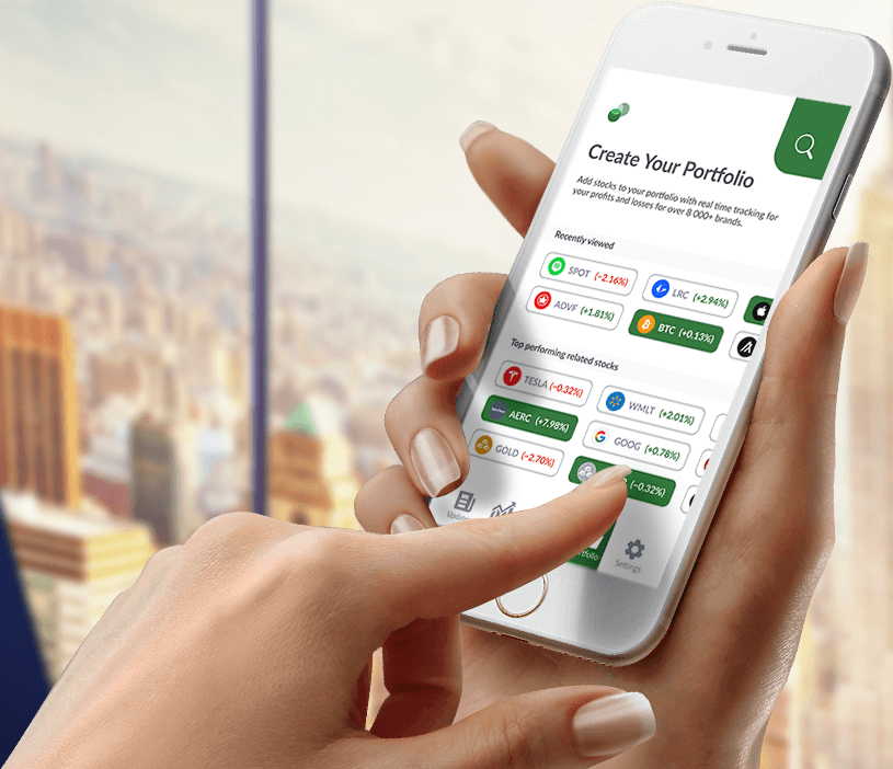
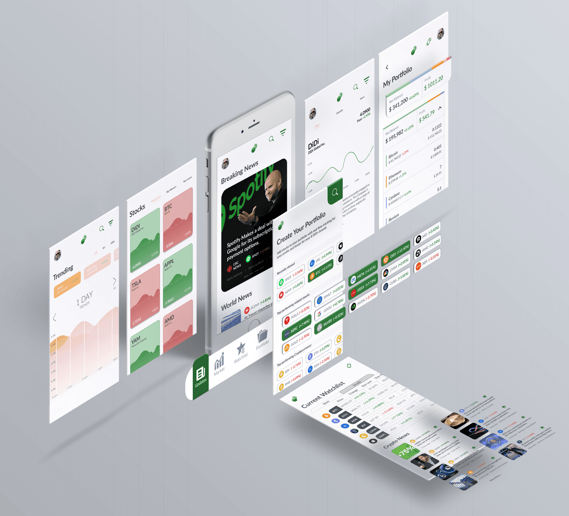
Our team aims to streamline the hectic information spread during the pandemic and construct a new user-friendly platform that will get individuals interested in investments. Pecunia comes equipped with asset management features such as portfolios and market charts to encourage users to utilize Pecunia in their journey to financial freedom. This tool reduces clutter while providing the user with detailed information related to their finances and community.
PROBLEM ✦
During covid, more than one-in-five Americans (22%) mentioned economic difficulties resulting from the pandemic. By contrast, just 13% mentioned positive financial changes that have resulted from the pandemic.
“I have also re-examined my finances and started changing some habits to be more cautious with my money.” Anonymous name, 45 year old man.
SOLUTION ✦
Pecunia aims to reinvent the wheel of mindless media consumption and provide users with a streamlined application that will coexist alongside a user’s path to financial freedom.
A system to reward good financial decisions, as well as a social environment to support excellent financial habits that can be adapted by many people.
A.E.I.O.U
A / Activities:
Our team used the A.E.I.O.U framework to structure all observations we during user research. Starting off, Activities are goal-directed sets of actions. What are the pathways that people take toward the things they want to accomplish, including specific actions and processes? How long do they spend doing something? Who are they doing it with?
Observations, General Impressions, Notes
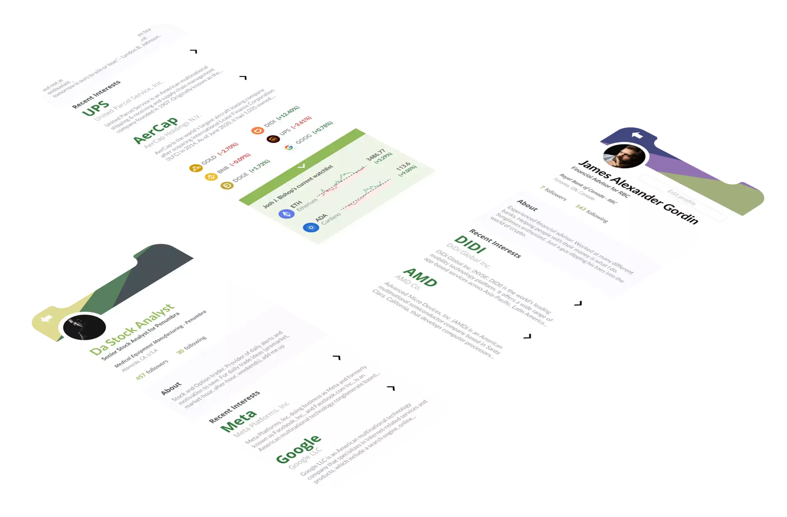
Our team wants to provide users with the tools and platform to develop successful financial skills. The capacity to learn must be derived from the user’s activity within this app. A wide array of stocks allows users to narrow their interests to what they are comfortable with. Tools can collect and arrange information to create easy-to-read summaries. Finally, introducing a social platform will link the user with other individuals with similar interests and offer them the opportunity to learn from their experiences. If the user desires, they may also add other trustworthy persons and contact them to build deeper bonds and accountability. We want to provide our users with as much streamlined value as possible.
Checking stock prices
Setting up a watchlist
Organizing Finance Portfolio
Viewing "positive or negative" trends
Showcasing news related to stocks
E / Environments:
Environments include the entire area where activities take place. For example, what describes the atmosphere and function of the context, including individual and shared spaces?
Typical Locations
Our team wants to provide users with the tools and platform to develop successful financial skills. The capacity to learn must be derived from the user’s activity within this app. A wide array of stocks allows users to narrow their interests to what they are comfortable with. Tools can collect and arrange information to create easy-to-read summaries. Finally, introducing a social platform will link the user with other individuals with similar interests and offer them the opportunity to learn from their experiences. If the user desires, they may also add other trustworthy persons and contact them to build deeper bonds and accountability. We want to provide our users with as much streamlined value as possible.
General Impressions of the Theme, Style
Our team wants to provide users with the tools and platform to develop successful financial skills. The capacity to learn must be derived from the user’s activity within this app. A wide array of stocks allows users to narrow their interests to what they are comfortable with. Tools can collect and arrange information to create easy-to-read summaries. Finally, introducing a social platform will link the user with other individuals with similar interests and offer them the opportunity to learn from their experiences. If the user desires, they may also add other trustworthy persons and contact them to build deeper bonds and accountability. We want to provide our users with as much streamlined value as possible.
I / Interactions:
Interactions are between a person and someone or something else, and are the building blocks of activities. What is the nature of routine and special interactions between people, between people and objects in their environment, and across distances?
List of Activities
Users reading comments of other people/influencers
User are reading regularly updated news articles.
Articles gathered by other publishers/websites
User replies to comments/messages from other users
Users reacting to posts and leaving comments & likes
Users frequently revisit their watchlist
Users checking stock charts/predictions out of curiosity
Environment affects stocks & changes the visuals on charts
Notable chart movements are labelled as daily trends
Users can view the stock and post predictions
After viewing notable stocks, experienced users take action
Users discover something interesting and save it to their watchlist.
O / Objects:
Objects are the building blocks of the environment, key elements sometimes put to complex or even unintended uses, possibly changing their function, meaning and context. For example, what are the objects and devices people have in their environments, and how do these relate to their activities?
General Impressions of Materials & Functions
We chose to create a mobile app rather than a website to make it easier for people to access our application. We also decided not to incorporate other physical objects in order to limit clutter and unnecessary dependencies. Our aim is to make Pecunia portable and versatile, allowing users to stay connected with their finances from any location. In the future, Pecunia may develop a website to cater to users who spend most of their time examining stocks on a desktop. Our goal is to make Pecunia as portable and versatile as possible, so that users can stay on top of their finances from anywhere.
E / Users:
Environments include the entire area where activities take place. For example, what describes the atmosphere and function of the context, including individual and shared spaces?
Users ranges around:
19-45 years old
Pecunia’s structure is simple enough to use in all ages of adulthood. Adults have fully developed their intellectual maturity and have been the most common demographic for intrests on finance. Users in their early adulthood are preassured to building their financial stability. Meanwhile users later in adulthood are more focused in stabalizing their finances for the goals of retirement or vacation. Pecunia’s purpose is to cater to both of these needs.
User characteristics
This app is very convenient as it lays the information in an easy-to-read and informative way. Users can start their day by using this app to stay connected to their surroundings and view recommended stock trends. These users would replace the hobby of watching the news with our app.
Based on the information we gathered on our AEIOU, we created 5 distinctly different scenarios from among the activities you list. See the information below to come up with detailed scenarios to include: user traits and motivation; tasks and barriers; strengths, weaknesses and concerns; and user expectations of the system. The scenario will provide the basis for the next stages of the project.
I was responsible for developing the app’s visual design so our team could build upon it. So I began to optimize the main page. Keeping with the green theme, I began to minimize visual distractions and separate each element with plenty of breathing room.
Our previous wireframe had a significant amount of data that overwhelmed the user. Adding some space and softening the borders of each box helps polish up this simple interface. The simple colour palette aided the design in being straightforward.
We chose the capital letter P to structure the logo for our app. We are resurfacing the brand name of Pecunia, which means money in Latin.
The lack of edges helps our logo appear less frightening. We aim to incorporate users everywhere.
